2020
🛠 ❤️ ONLINE - FUN / PLAY - Chrome Experiments | Experiments with Google (Work principaly with Chrome)
Chrome Experiments est une vitrine du travail de codeurs qui repoussent les limites de la technologie Web, créant de belles expériences Web uniques.
Vous trouverez des liens utiles dans tout le site pour créer vos propres expériences, et vous pouvez également explorer des ressources comme WebGL Globe et notre atelier d'outils.
2013

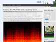
Exploring the HTML5 Web Audio: visualizing sound | Smartjava.org
In this article I'll walk you through a couple of steps that shows how to do the following:
Create a signal volume meter
Visualize the frequencies using a spectrum analyzer
And show a time based spectrogram


2012

sigma.js | a lightweight JavaScript graph drawing library
An open-source lightweight JavaScript library to draw graphs, using the HTML canvas element
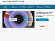
JavaScript InfoVis Toolkit
The JavaScript InfoVis Toolkit provides tools for creating Interactive Data Visualizations for the Web.


2011


Beautiful web-based timeline software
A nifty and beautiful timeline tool. Very good ergonomy ideas.


2010


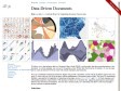
Hive Plots - Linear Layout for Network Visualization - Visually Interpreting Network Structure and Content Made Possible
hive plot — a rational visualization method for drawing networks in which nodes are mapped to and positione


